
Clear before clever.
Say what we make and how it helps. Use specific deliverables and straightforward next steps.
 form&matter.Identity system / Edition 01View website ↗
A considered identity for an independent studio
that brings brands and websites together.
Form & Matter connects what a business stands for with how it shows up.
The studio’s offer is deliberately coherent: positioning, identity, and the website as one connected experience. The visual identity should feel clear, capable, and interested in the details.
Brands with character. Websites with purpose.
Good business. Great presence.


Two folded forms come together around a square of negative space. The mark connects identity and implementation: separate disciplines, one resolved whole.
Keep clear space at least half the mark’s height. Use the symbol at 24px or larger for interface applications; the simplified favicon remains legible at 16px. Keep production logos flat: no distortion, outlines, or colors outside this palette. Depth and shadows belong only to the approved motion studies, not the master logo files.
Electric lime sets the signal against black. Fern, moss, and silver bring depth without competing for attention. Smooth aurora gradients bring atmosphere to the dark stages. Matte surfaces and a subtle dot grid give each section its own character. Fluted glass is reserved for small floating accents, like the type specimen and contact mark. Reading surfaces stay clear; the original interlocking mark and each project’s own identity remain intact.
Aa. Good
on purpose.
You’ve built something worth believing in. We make sure it looks the part.
MANROPE / LABEL / SEMIBOLDBrand identity & website design ↗
COURIER NEW / INDEX / REGULAR01 / SELECTED WORK
Display: medium weight, compact leading, tight tracking. Body: regular weight, generous line height. Use sentence case in the studio’s voice. Uppercase is limited to small project artifacts and indexing.
Independent minds.
Considered design.
A simple two-sided stationery direction: Ink for introductions, Signal for recognition. Add verified contact details when the domain and business identity are confirmed.
The interlocking forms become a frame, a signature, and a full-scale graphic. Same geometry. Ink, Paper, and Signal, with Black as an accent. A recognizable voice wherever the studio shows up.
A confident close.
A familiar introduction.
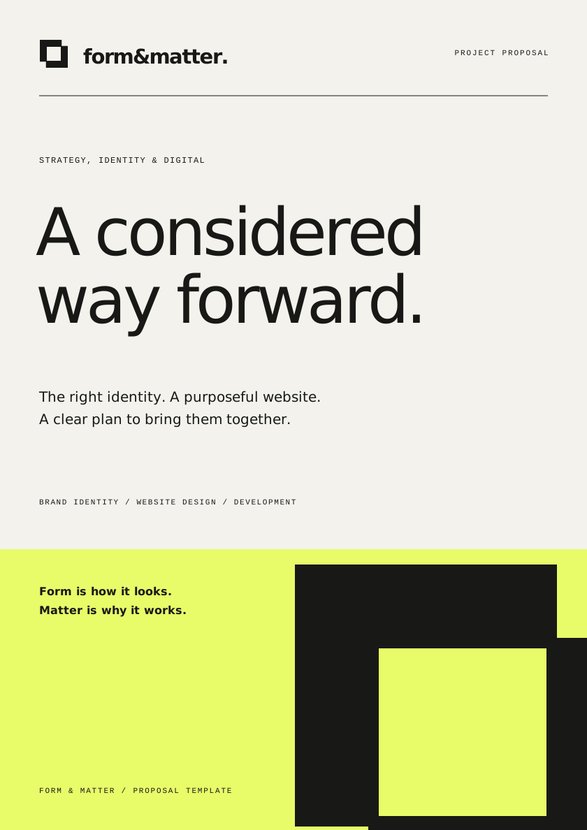
All three applications are editable vectors. The proposal cover is ready for project-specific details; the signature is an identity graphic, ready to pair with verified contact information. For email clients, export the vector as a PNG before embedding. Typography uses Manrope with a sans-serif fallback.
The two parts of the existing mark assemble and separate, making the connection between form and matter visible. A pointer-responsive preview brings that geometry into the visitor’s space.
Motion has a purpose: introduce the identity, respond to attention, and guide the next action. Keep the forms intact, the movement measured, and the content easy to read. Respect reduced-motion settings with a composed, static mark and immediate access to every interaction.
Say what we make and how it helps. Use specific deliverables and straightforward next steps.
Let the work establish credibility. Avoid fabricated results, client lists, years in business, and awards.
Speak to the business owner. Explain decisions, invite useful feedback, and make the process understandable.
The name is a proposed creative identity. Trademark and domain availability have not been checked. Alder House, Sela, and Rivet are clearly labeled studio concepts, with original generated imagery and code-built graphic applications.